[fusion_builder_container hundred_percent=”no” equal_height_columns=”no” hide_on_mobile=”small-visibility,medium-visibility,large-visibility” background_position=”center center” background_repeat=”no-repeat” fade=”no” background_parallax=”none” enable_mobile=”no” parallax_speed=”0.3″ video_aspect_ratio=”16:9″ video_loop=”yes” video_mute=”yes” overlay_opacity=”0.5″ border_style=”solid” padding_top=”20px” padding_bottom=”20px”][fusion_builder_row][fusion_builder_column type=”1_1″ layout=”1_1″ spacing=”” center_content=”no” hover_type=”none” link=”” min_height=”” hide_on_mobile=”small-visibility,medium-visibility,large-visibility” class=”” id=”” background_color=”” background_image=”” background_position=”left top” background_repeat=”no-repeat” border_size=”0″ border_color=”” border_style=”solid” border_position=”all” padding=”” dimension_margin=”” animation_type=”” animation_direction=”left” animation_speed=”0.3″ animation_offset=”” last=”no”][fusion_text]
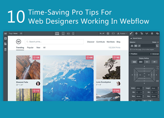
Webflow is a pretty straightforward tool known to those who are familiar with how the web works. To start building a gorgeous website, you don’t need to read a library full of documentation. The following are 10 time-saving pro tips for web designers working in Webflow:
1. Use non-HTTP links by adding a backtick (or grave)
Put a backtick in front of the code, then hit Tab or just click out of the field whenever you need to add special code instead of an HTTP link and Webflow won’t add the infamous http://. What you can put in an HREF attribute constantly evolves and therefore this is handy. As far as HTTP, mailto, tel and anchor links are concerned, Webflow has you covered. But that backtick will be required by any new functions that crop up.
2. Vertically center an anchor link’s destination with custom attributes
The anchored section typically comes to the top of the page, or just below the navbar on clicking an anchor link in Webflow. Add a new custom attribute to the section called data-scroll and set its value to mid if you want to bring the anchored section into the middle of the viewpoint instead. You can add a new custom attribute by selecting the element you’re anchoring to (not the link that triggers the scroll) and switching to the Settings tab and clicking the + icon. Now, when you click its anchor link, the section will center itself in the viewport. The best website development company works in this method.
[/fusion_text][fusion_text]
3. Control the speed of the smooth scroll to an anchor
You can tell a link to anchor down to a section when an element has that section ID defined. With an ease-in-out easing mode over 1000 ms (that’s one whole second), the page will smooth scroll to that ID when a user clicks that anchor link. Now, when it comes to an interaction, one second is a long time. Any time between 200 and 350 ms is taken by most click and hover interactions. It may require a little more time by a long scroll. With custom attributes, you can change the scroll speed.
4. Target an element with a combo class in an interaction
In an interaction, you can target an element with a combo class. It is safe to use.
5. Do math right in a Webflow field
Webflow can do the math for you while you are designing. Hit enter or tab after entering your calculation into any of the width/height fields in the Style tab and watch the magic happen. The unit in which you want the final calculation must be added.
6. Highlight all elements with the same class
You get to know how many instances of the current selector appear on the page you are working on and other pages from the label under the selector field. It can help keep you from modifying elements that are just right the way they are and therefore it’s very convenient. You can also make decisions about when to create a combo class, or a whole new one, with its help. To visually highlight all elements with the same selector, you can click that helpful message.
[/fusion_text][fusion_text]
7. Clear styles with an Option/Alt + Click
You can end up going back and forth on a lot of design decisions in the early stages of a design. Clearing a style from bigger screen sizes as you work through your responsive breakpoints will do the trick. To remove a style adjustment from an element, there is a quick and easy way. Hold Option (on Mac) or Alt (Windows) as you click after hovering over any blue-highlighted style you added. The style you added will immediately be cleared out by that. This process is often followed by a web design company.
8. Adjust multiple margin/padding values at once with Alt/Shift + drag
While you drag the margin or padding value to adjust two opposite sides (top and bottom or left and right), hold Option (Alt on Windows). To adjust all four sides at the same time, hold Command (Control on Windows).
9. Speed up unit updates with Shift
While you hit the up or down arrow in any unit box (i.e. margin, padding, width, height, font size, etc.) just hold Shift to move by tens instead of ones.
10. Move through elements in Navigator order with Option + Up or Down arrow
Select an element and then hold Option as you hit the Up or Down arrow if you need to quickly get to a parent or child element without switching to the Navigator. With the help of this, you can quickly travel through nested and parent elements and will move between sections unlike just using the arrows, after you’ve passed up the last child in the previous section.
[/fusion_text][/fusion_builder_column][/fusion_builder_row][/fusion_builder_container]